Nau Engine
Nau Engine GUI system
The core of the GUI system lies in the codebase of cocos2d-x, a reliable and developed framework for creating 2D games that has been adapted to meet the needs of creating user interfaces.
In Nau Engine, the user interface can be completely constructed not only through code but also using a separate editor. To do this, you first need to create an interface scene as an asset. Then these data can be used by initializing them through the user component's code, allowing the loading of the interface into the application during its operation. This approach significantly simplifies the construction of the interface and allows people who are not familiar with programming to work on it.
The creation of the interface in the Nau editor consists of the following main steps:
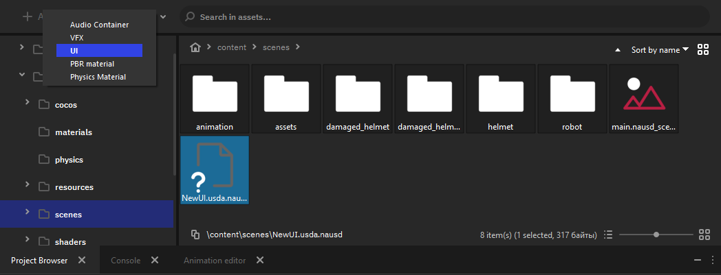
- Create a new UI asset in the project browser
- Double-click on the created asset, and its data will be displayed in the Outliner window.
- Create new elements in the interface structure. Organize the UI elements in the scene hierarchy and set their parameters in the Inspector. In the Viewport window, you can see how the interface will look like in the game.
- Save the configured interface.
- Load the ready-made user interface through a script.
Let's consider preparing the interface through the editor in more detail.
Creating and working with GUI scenes
In the project folder, you need to create a new GUI asset file.
To do this, select the UI item from the menu of creating a new asset. A new GUI asset file will be created in the folder that is currently open in the project browser.
Open the created scene by double-clicking on the file. In the Outliner window the contents of the loaded interface will appear.
Layout of the interface
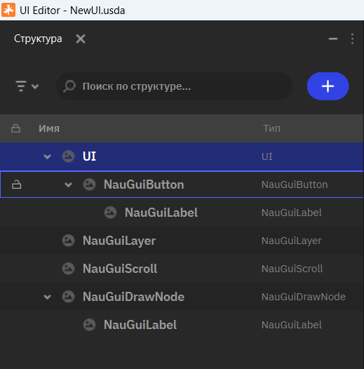
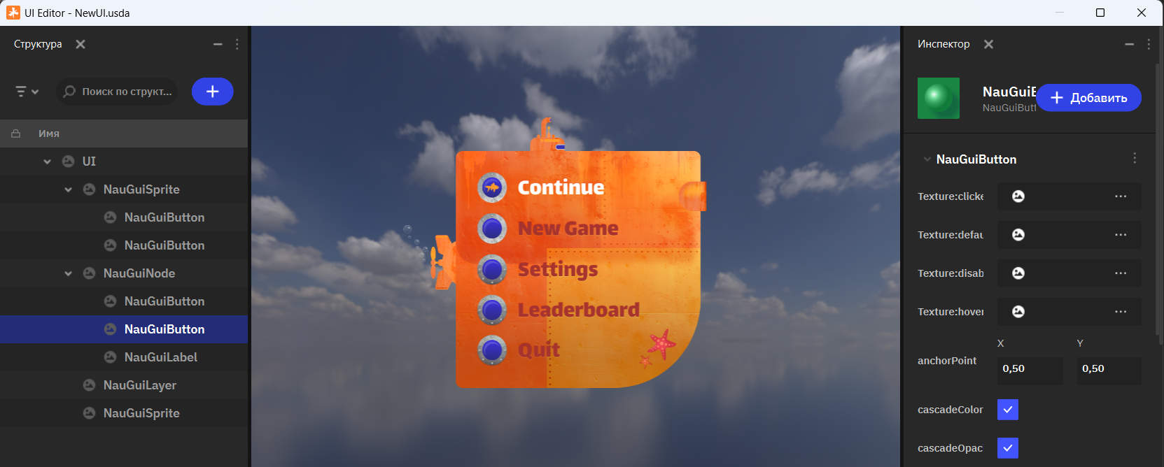
The layout of the interface is built according to standard principles accepted in the industry. The GUI element relies on an element hierarchy represented as a tree in the Outliner window (1).
You can create new elements and move them within the hierarchy. Like with the 3D scene hierarchy, the coordinates of an interface element are specified relative to its parent's coordinates.
In the Viewport window (2) all the GUI elements of the scene will be displayed. The preview allows you to configure the interface while assessing the result close to the final one. During testing, it is possible to assess the layout of the interface at different screen aspect ratios by simply changing the size of the Viewport window.
The Inspector window (3) allows you to adjust the parameters of selected elements. The set of parameters for a particular element depends on its type.
Standard Element Types
Initially available are standard types of elements that you can use to create complex interfaces for most typical tasks.
- Node (Basic element) - The basic service element of the interface. Can be used to organize and arrange element hierarchies or groupings.
- Button (Button) - An element that provides button functionality, interacting with a mouse pointer. Supports multiple states (such as hover, click, or active state) and switching between them.
- Draw (Figure) - Allows you to display a quadrilateral (for example, draw a square or trapezoid) without using raster images.
- Label (Text) - An element for displaying text.
- Layer (Layer) - Enables the grouping of elements into a layer.
- Scroll (List) - An element necessary for implementing scrollable areas.
- Sprite (Image) - An element displays an image specified in its parameters.
Element Parameters
When selecting an interface element in the Outliner, its parameters are displayed in the Inspector window.
All elements have several parameters to configure them in the GUI editor. Some parameters are common to all elements, while others are specific to a particular type.
Node
Since all elements rely on the basic Node type, many available parameters are shared among them.
Parameters such as position, rotation, scaling, anchor, name, and others allow you to adjust fundamental properties of an element. The debug drawing parameter (enableDebugDrawing) is useful for visualizing a technical outline of the element. The "Visibility" parameter allows you to show or hide an element.
Sprite
This type is primarily used to display raster images. Besides basic parameters, you can specify an imported image in the project and assign a color filter to its texture in the colorRGBA parameter.
Label
The text element displays text specified in the text parameter. You can select a font format *.fnt for the text. Additionally, you can adjust vertical and horizontal text alignment, specify whether to wrap words or symbols, and limit the text size within an element.
Draw
Allows creating quadrilaterals without using textures. Enables specifying stroke and fill colors as well as flexibly configuring the figure by setting coordinates of each of its four corners. This element is suitable for creating dynamic figures whose form can be animatd in real-time.
Button
An interface element that responds to clicks. You can specify textures for different button states ("Normal", "Hover", "Click", or "Disabled"). For each state, you can also adjust additional parameters such as a color filter or scaling.
Scroll
Enables creating scrollable lists of elements vertically or horizontally. Has additional style and design parameters.
Layer
Allows configuring layers of grouped elements and simplifying control over interface blocks.
Creating a Game Interface
Creating a game interface is a creative and complex process that involves planning, research, layout, and testing. The editor has all the necessary tools to help you with this task.
Remember the main stages of creating an interface for users:
- Planning and Research: Determine which elements are useful in the interface, study other games, and analyze user needs.
- Structure and Navigation: Develop a clear and intuitive structure with menus, buttons, indicators, and timers that make navigation easy.
- Layout: Create a layout based on design principles and ergonomics using tools to determine the placement and size of elements.
- Interface Elements: Determine the role of various interface elements. Menus can be composed of lists and groups of buttons. Each button should be linked to an action. Don't forget about indicators of state and feedback on interaction with the interface. Every successful action must be accompanied by a reaction from the game (animation or sound). Use graphical and text elements to indicate reactions to interaction.
- Adjusting Elements: Change sizes, colors, fonts, and parameters for flexibility under different screen resolutions and aspect ratios.
- Testing: Conduct testing on real users to identify weaknesses and opportunities for improvement.
- Improvement: Regularly analyze the interface and make changes to improve functionality and attractiveness.
Creating Logic
In Nau Engine, the system of user interfaces is separate from the system of game object components. This allows the user interface to function independently of loaded 3D scenes, making it possible to use it freely wherever needed.
To interact with GUI from game logic, you need to use a special adapter component that simplifies connecting interfaces in game scenes. Through this component, it is easiest to access GUI elements from game code.